Joey's design study
Joey Scarr (Talk | contribs) (→Final evaluation) |
Joey Scarr (Talk | contribs) (→Critique) |
||
| Line 60: | Line 60: | ||
== Critique == | == Critique == | ||
| − | I found it reasonably difficult to get this design right when I was first creating it, so I just went with the | + | I found it reasonably difficult to get this design right when I was first creating it, so I just went with the simplest thing I could think of that worked (see [[Do the simplest thing that could possibly work]]). I couldn't [[Model the real world]] to figure out how everything should behave, since nothing here exists in the real world - and although there are reasonably well-defined domain concepts in play here, they didn't entirely help when deciding where each responsibility belonged. |
Below are some of my concerns with the existing design. Each issue is numbered and will be referenced later during the improvements section. | Below are some of my concerns with the existing design. Each issue is numbered and will be referenced later during the improvements section. | ||
Revision as of 22:40, 29 September 2010
Contents |
Blur: Project Summary
My Honours project, nicknamed Blur, is a program that provides a global command line interface which mirrors the functionality of the GUI in any application. It uses self-demonstration to encourage users to transition from the GUI to the command line. In other words, whenever the user invokes a command with the GUI, Blur pops up showing the command line text that will perform the equivalent action.
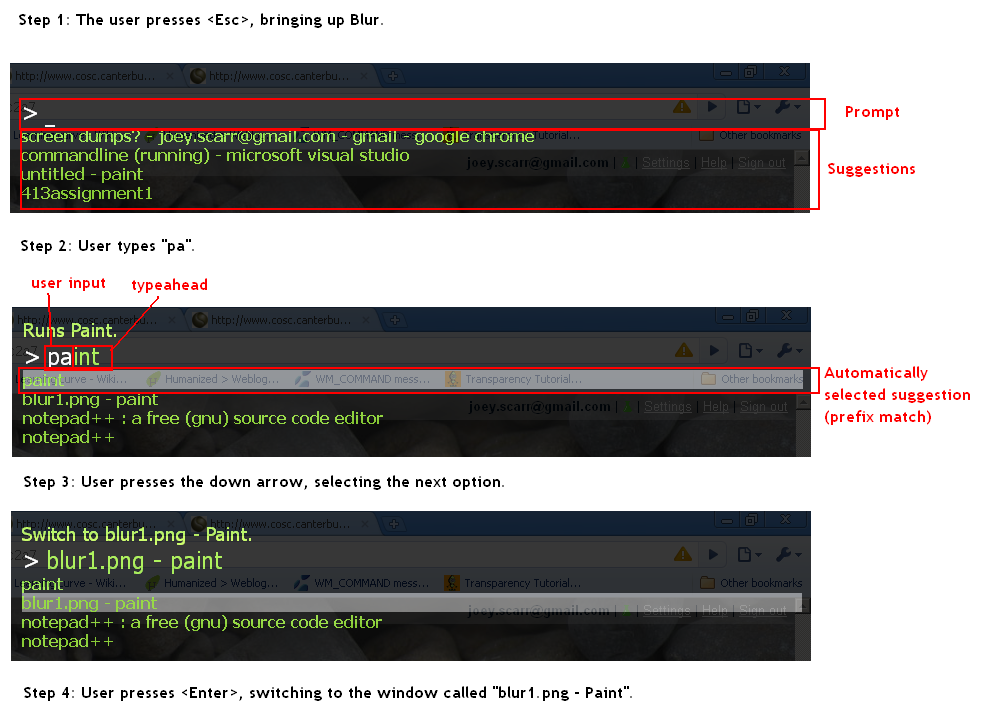
Examples of the auto-complete in action
An example of the self-demonstration feedback
Design Goals
- Provide a text interface to commands
- Provide intuitive typeahead and auto-complete suggestions
- Allow different types of typeahead
- Autocomplete and display typeahead on command names
- Autocomplete and display typeahead on parameters within commands
- Create a reusable autocomplete component (i.e. not coupled to Blur-specific functionality)
- Command suggestions should be unambiguous (not currently the case)
Initial Design
This design study focuses on the auto-completion functionality, because it's the most interesting component and (in my opinion) the least well-designed.
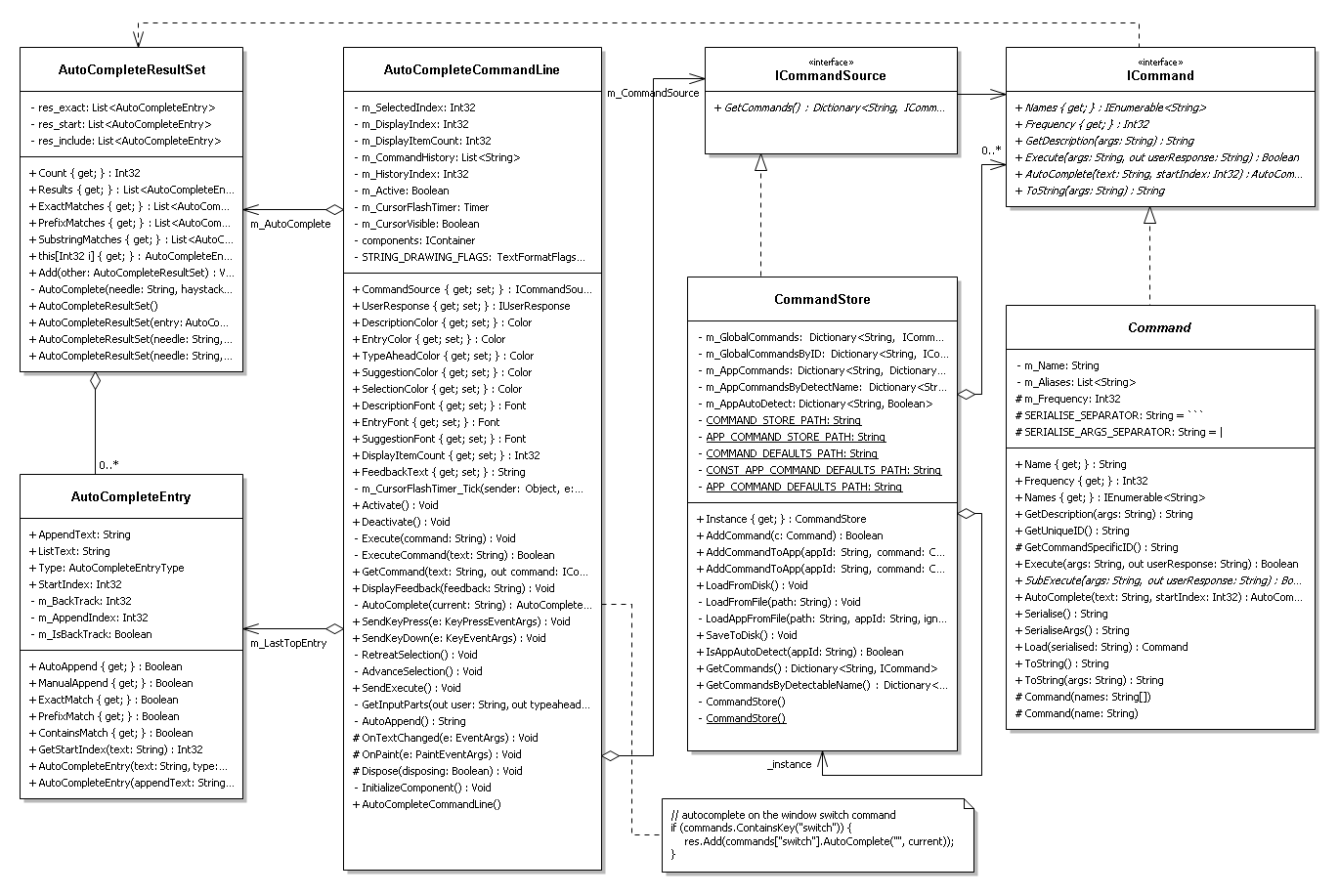
The following UML diagram shows my initial design. Some details have been omitted for clarity, such as the entire class hierarchy of Commands (only the abstract Command class is shown).
Tour of the design
This section describes each of the classes shown above.
AutoCompleteCommandLine
The AutoCompleteCommandLine is the only GUI control on the main form. This class contains most of the logic for the auto-complete functionality, and is responsible for drawing the command line prompt, user input, typeahead and other feedback on the form. Whenever the user inputs some text to the command line, it generates a new AutoCompleteResultSet, and displays the top 4 auto-complete suggestions in the list.
AutoCompleteResultSet
This is essentially a collection of AutoCompleteEntries, with some custom logic. It needs to be able to order AutoCompleteEntries in order of relevance, by sorting them into three categories: exact matches, where the user's input exactly matches a valid command, prefix matches, where the user's input matches the beginning of a valid command, and substring matches, where the user's input matches some inner substring of the command. Internally, it uses three separate lists to achieve these (res_exact, res_start, and res_include), and each of these lists is sorted in order of the frequency of use. The AutoCompleteResultSet also contains the logic to populate itself, given a search string and a list of possible command strings.
AutoCompleteEntry
AutoCompleteEntries, which represent the command suggestions that show up beneath the command line, are internally represented as strings. An AutoCompleteEntry stores a string field called ListText, which is displayed in the suggestion list, another string called AppendText, which is appended to the user's input, and a GetStartIndex() method that figures out where the AppendText should be appended, given a user input string. Each AutoCompleteEntry has a couple of integers to figure out where the auto-completion started, and where the typeahead should be appended.
ICommandSource and CommandStore
The AutoCompleteCommandLine searches for commands from an ICommandSource, which is set externally via the CommandSource property. The ICommandSource interface has a single method called GetCommands(), which returns a dictionary of available commands, indexed by their names. This interface should enable reuse of the AutoCompleteCommandLine component by allowing clients to define their own command sources. The AutoCompleteCommandLine takes all of the names from GetCommands() and uses them to construct an AutoCompleteResultSet.
The CommandStore class is an implementation of ICommandSource, which takes care of serialising the detected commands and storing/retrieving them from disk.
ICommand and Command
ICommand provides a minimal interface to commands, that exposes only the functionality required by the AutoCompleteCommandLine. Implementing this interface is an abstract Command class, which provides the functionality common to all Blur specific commands. Command has a bunch of subclasses (not shown) which implement the individual command functions, such as window switching, app launching, and in-application control. (It's worth noting that this is an obvious example of the Command pattern, which is a design decision discussed in the final section.)
Critique
I found it reasonably difficult to get this design right when I was first creating it, so I just went with the simplest thing I could think of that worked (see Do the simplest thing that could possibly work). I couldn't Model the real world to figure out how everything should behave, since nothing here exists in the real world - and although there are reasonably well-defined domain concepts in play here, they didn't entirely help when deciding where each responsibility belonged.
Below are some of my concerns with the existing design. Each issue is numbered and will be referenced later during the improvements section.
Coupling between the modules (1)
Ideally, I would like the auto-completion logic (the left-hand side of the diagram) to be decoupled from the underlying command logic (the right-hand side of the design). In other words, the right-hand side of the diagram should stand alone as an API, and not know anything about the auto-completion/GUI side. This is mostly the case, but there are a couple of nasties. The worst example is shown by the dependency relationship across the top of the diagram - this is because ICommand has an AutoComplete method which returns an AutoCompleteResultSet. Also, the AutoCompleteCommandLine is hardcoded to search for a "switch" command in the ICommandSource dictionary (shown in the code snippet in the diagram), and if it exists, to autocomplete on its parameters without having to have the "switch" keyword present (an example of this kind of autocomplete entry is shown in the 3rd screenshot at the top of the page). This is a nasty piece of hardcoding that should really be more general.
AutoCompleteCommandLine bloat (2)
The AutoCompleteCommandLine violates the Single responsibility principle, being in charge of the view shown to the user, as well as the underlying model. It's worth noting here that there are also a lot of configuration properties (getters and setters) on the control -- although this may seem like overkill (and possibly a third responsibility), it's the standard way GUI controls are implemented in C# and so I'm not treating it as a design flaw.
It may be a good idea to implement some variant of Model view controller here in order to separate the view from the typeahead logic etc. This way, the GUI could be replaced later while keeping the underlying model the same. However, this is a pretty unlikely scenario and may not be necessary.
AutoCompleteEntry issues (3)
There are a number of problems with the AutoCompleteEntries. First of all, they expose public data directly (violating Hide data within its class), as well as containing methods that deal with part of the autocompletion logic. Ideally, this would be either a pure data class, or the data would be private and the AutoCompleteEntry would contain all of the logic for autocompletion. The former would possess the Data class smell, but I don't think this is particularly important (the merits of each approach will be explored later, in the redesign). At this stage, the class is a nasty hybrid, with the AutoCompleteEntry finding the index in the string at which to start the autocomplete, and the client (the AutoCompleteCommandLine) performing the rest of the work.
The second problem with the AutoCompleteEntry is that it is entirely string-based. This causes ambiguities between different types of auto-completion: for example, the command line could be auto-completing on an app (e.g. "firefox") and the name of a folder (also called "firefox") at the same time. When this happens, one will override the other. These ambiguities could be solved by representing each AutoCompleteEntry as a command and a parameter list. This technique would also be a lot more flexible when improving the auto-complete in future.
Finally, the integer fields (m_BackTrack and m_AppendIndex) are just really nasty. Their purpose and relationship to each other is non-obvious, and they are extremely inflexible: they only allow typeahead at the end of the input string. Typeahead at any point in the input string is desirable (for example, so "visu" can autocomplete to "microsoft visual studio"). This needs to be fixed.
AutoCompleteResultSet is too specific (4)
At this point, AutoCompleteResultSet is based on three underlying lists with hardcoded purposes. This is bad - if at any point in the future I want to change the way suggestions are ordered, I have to completely rework this class. Ideally, the AutoCompleteEntries would know how to order themselves, and then this class could be made redundant by a simple sorted list.
Naming (5)
AutoCompleteEntry is a poor name. It isn't self-explanatory enough (a better name would reflect its nature as a suggestion to the user). AutoCompleteResultSet is also poor - not only does it contain AutoCompleteEntries, rather than "AutoCompleteResults", but it isn't a set (it relies on ordering and functions more like a sorted list).
Too many getters? (6)
My design has a moderate number of Getters and setters. This suggests that I might not be following Tell, don't ask as much as I could be. I'll address this in the redesign.
Redesign
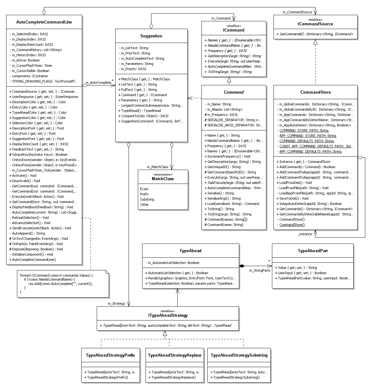
This new design addresses most of the concerns of my critique above.
Improvements
This section simply describes the improvements made since the original design. Contentious design decisions and other issues will be discussed in the final evaluation section.
Renaming and responsibility shifting
The autocomplete module has had a complete overhaul in this iteration. AutoCompleteEntries are now Suggestions, and the AutoCompleteResultSet has been completely removed in favour of a sorted list (this fixes Issue (5)). The new Suggestion class is now in charge of performing the typeahead, and the Strategy pattern has been used to make this behaviour a lot more flexible. TypeAheadStrategy has a set of concrete subclasses that perform different types of typeahead depending on the context.
Encapsulation of the typeahead behaviour
Each call to Suggestion.TypeAhead() returns a TypeAhead object, which is a list of TypeAheadParts (each of which is just a string with a flag determining whether it was automatically generated). A TypeAhead is capable of rendering itself, meaning the TypeAheadParts can be nicely hidden behind the TypeAhead object (since all they're used for is drawing different-coloured text to the screen). This is a good example of Information hiding, Keep related data and behavior in one place, and Tell, don't ask, since clients of the TypeAhead object simply give it a graphics context and tell it to render (rather than asking it for its data). The downside is that the TypeAhead class has to know about the view, but this seems okay to me given that it's an innately GUI-based class anyway.
Suggestions now remember the context in which they were created (i.e., the current input of the user, the part of the user string that was being auto-completed, and the specific suggestion). This means that it can delegate all of this information to its TypeAheadStrategy, and also define its own ordering against other Suggestions (replacing the old AutoCompleteResultSet logic). The Suggestion now knows what class of match it is (using the MatchClass enum), and can use this information (as well as other factors) when determining ordering. This removes the need for the AutoCompleteResultSet, and fixes Issue (4). I took the opportunity while refactoring this to add another class of match which is ordered by the length of its longest common subsequence)).
The Suggestion decides which typeahead strategy it will use in the constructor. Depending on how the user's input matches the suggestion, it will choose one of the following:
- TypeAheadStrategyPrefix: When the user input is a prefix of the suggestion, such as "micro" for "Microsoft Visual Studio".
(TODO: insert image)
- TypeAheadStrategySubstring: When the user input is a substring of the suggestion, such as "visu" for "Microsoft Visual Studio".
(TODO: insert image)
- TypeAheadStrategyReplace: When the user input doesn't match the suggestion at all, and the user has selected it manually (e.g. with the arrow keys).
(TODO: insert image)
Together, these changes fix all of the problems with the old AutoCompleteEntry class (Issue (3)). The better encapsulation also address Issue (6) to a certain degree, reducing the number of getters necessary.
Suggestion now encapsulates a command and its parameters
Instead of strings, each Suggestion now stores a reference to a Command, and the parameters that would be sent to the command if this suggestion was executed. This removes all of the naming ambiguity present in the old design (e.g. running an app with the same name as an open window).
Removed hardcoded command names
As demonstrated by the code snippet in the diagram, I was able to remove the hardcoded reference to the "switch" statement. I replaced it with a boolean property in the Command API called NeedsCommandName. If the concrete Command returns false for this value (which the switch command now does), the command can be invoked without specifying its name (in other words, only the parameters are required). This makes the Command API more general, and the AutoCompleteCommandLine now no longer has to make assumptions about the existence of specific commands. This fixes half of Issue (1). It's worth noting here that this does introduce some minor ambiguity if multiple commands have NeedsCommandName == false and accept the same parameter, but in this iteration the only command requiring this capability is "switch".
Final evaluation
This section discusses the strengths of my final design, as well as some issues that were left unresolved.
Strengths of the design
The final design is
Unresolved issues
The observant reader will have noticed that Issue (2) was left unresolved by my improvements. While a significant amount of logic was removed from the AutoCompleteCommandLine (and encapsulated within Suggestion), it still appears to violate the Single responsibility principle -- being responsible for both the view and the model. I originally discussed separating out the view from the model with some variant of Model view controller, leading to a better Separation of concerns, but I decided against this. Given that the underlying model (the auto-complete system) is GUI-based anyway, and specific to this GUI, I decided that the benefits of refactoring this did not justify the cost, and invoked You ain't gonna need it.
One other problem that I was not able to solve (mentioned in Issue (1)) was the dependency relationship between ICommand and SuggestionList. In fact, this coupling has been somewhat worsened: Commands now need to know about Suggestions as well as SuggestionLists, since the Suggestions are created on the Command side. This has led me to rethink whether or not this dependency is actually an issue. Conceptually, it does make sense for the Commands to be able to provide Suggestions. Perhaps the issue therefore lies with where I'm trying to draw the boundary between the "modules". Now that the auto-completion logic is self-contained within the Suggestion/TypeAheadStrategy classes (i.e. decoupled from the AutoCompleteCommandLine), they could probably be in the same module as the Commands. This way, the GUI is still separated from the underlying logic, so my design goal has been achieved in that respect. This is reflected in the second UML diagram - there is now a distinct separation between the AutoCompleteCommandLine on the left, and everything else (the Command/TypeAhead module on the right).


